At Ideagen DevonWay, our customers’ success and satisfaction are a core driver in everything we do. Part of that commitment is making sure it’s as easy and clear as possible to use our software. With that in mind, we are constantly looking for ways to improve our user interface, or UI.
As we move into the year ahead, we’ve identified a few areas that could be more streamlined, easy to understand or simply done better. It’s all part of offering the most useful (and usable) experience possible. Take a look at what’s in store for our updated UI in 2024.
Areas of improvement within the current UI
Our products are designed to help users find the information they need quickly and accurately, helping them and their organizations operate effectively through one seamlessly interconnected platform. (In case you haven’t yet made the switch to Miramar UI, see why now is the time.)
Coming from high-risk, highly regulated industries, our customers carry out complex work, often needing to move between a variety of interrelated documents and processes to accomplish their goals. These winding paths can be disorienting, so we’re adding new capabilities to help users keep track of where they are, where they’ve been, and what they’re working on.
This starts with improvements to our navigation tools that make using Ideagen DevonWay more intuitive and more reliable. After listening to those at companies who use DevonWay every day and identifying points of friction, we’re excited to share a series of user experience enhancements coming this year.
UI changes and improvements coming soon
Our team has identified areas of improvement and new features that we are taking action to implement right away. Here is a preview of new features we’re working on now.
Breadcrumbs
Breadcrumbs are a well-understood mechanism for navigating the web, providing an easy-to-follow trail of the pages users have traveled. Breadcrumbs also provide a fast way to backtrack if wrong turns are taken. We’re adding them to Ideagen DevonWay to help users more easily find their way through the system. An improved breadcrumb feature is in the works, which is being built with our users in mind.
Thinking rarely happens along a straight line, and our breadcrumbs will help users move through records, find answers, and confidently perform their work no matter how many twists and turns they take. Our breadcrumbs will keep track of every search, record, report, and dashboard a user visits, presenting them in an always-visible list at the top of the page, ready-at-hand for moving into, out of, and through trains of thought.
Priority: HIGH
Hierarchical Data Display
Viewing and understanding scenarios in which information is nested can get confusing. For example, if one document refers to a building and that building has several wings, and each of those wings has many rooms, and each of those rooms has various drawers, cabinets, and boxes, it’s easy to lose track of where you are when you’re looking for the pair of scissors you know you left in that drawer… somewhere.
To help users recognize when data exists in this kind of hierarchical relationship, we’re making changes to certain UI elements, bringing related information closer together on the page and making it easier to see when information belongs to a “parent”. These kinds of changes can seem small, but when they’re applied to parts of our product that people use all the time, small changes can make a big difference.
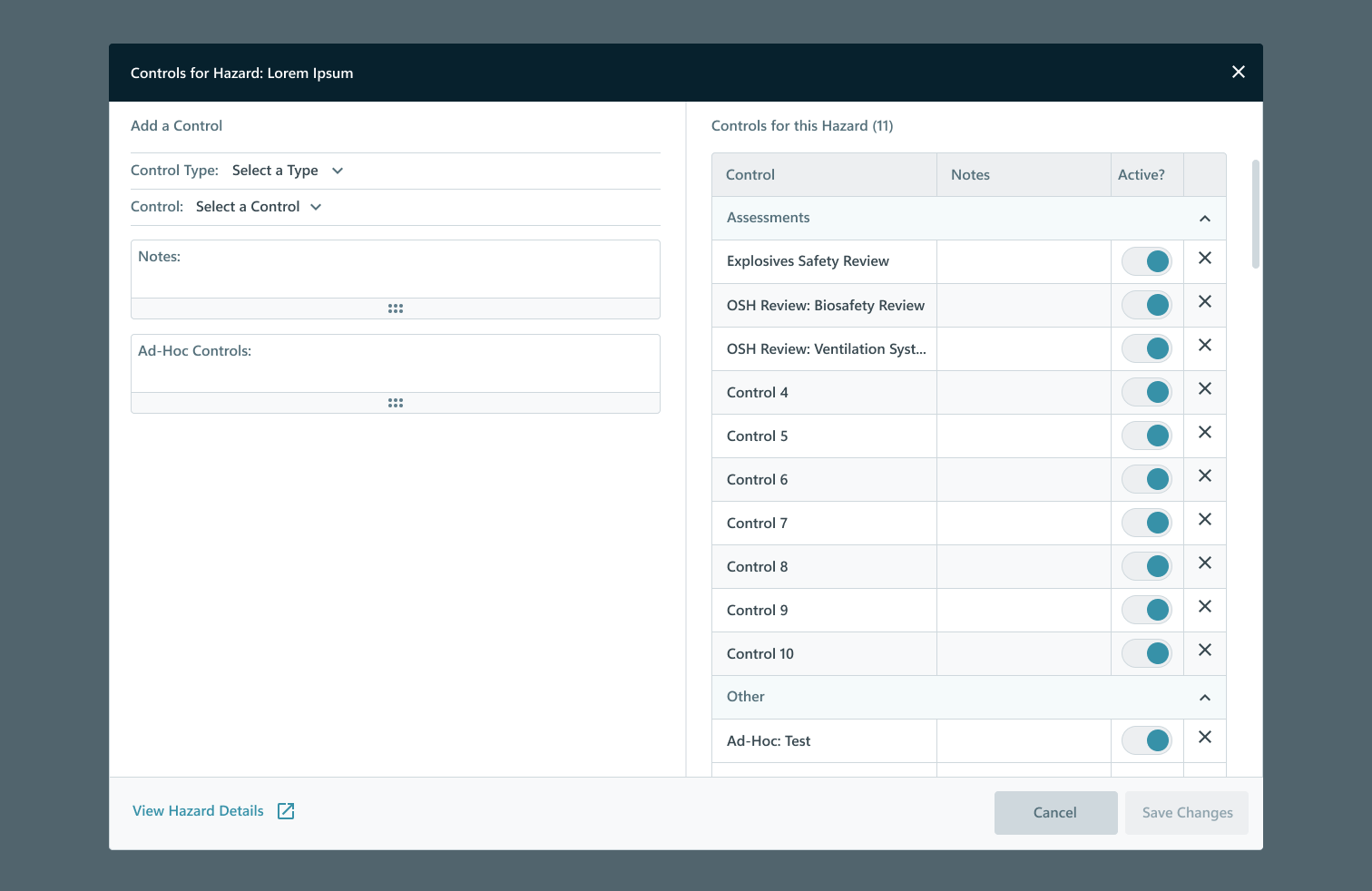
In addition to changing how we display data within a record, we’re creating new ways to view and act on other records without losing your place. We’re building new pop-ups to allow users to do things like add new records or view related records without leaving the page they’re working in. Preserving context in this way helps people keep their bearings, even as they work through different levels of information.
Priority: MEDIUM
Process Tree
The Process Tree is an important element in the way Ideagen DevonWay displays records, showing all of the other records related to the one in view. This information is vital to understanding the broader context of a particular document, but we realize it hasn’t always been well understood.
This year, we plan to unveil a new Process Tree that is more informative and more understandable. This will include grouping items by type in collapsible regions, using human-readable titles alongside system identifiers, and displaying the item’s status.
Additionally, we are exploring expanding our Process Tree with a full-screen map. When it comes to finding your way, nothing beats a map – and this workflow diagram will present a comprehensive view of the work process and record relationships users need to understand to get the big picture.
Priority: MEDIUM-LOW
Share your thoughts and feedback
With customer success as a driving focus for our team, we are always open to hearing from our users about what’s working well and what could use some adjustments. Let us know what you think about these upcoming updates as well as any other ideas you may have to create the best user experience possible. Reach out today!
Related Posts
DevonWay Mobile 1.35 Release Highlights
We're excited to share updates and new features to iOS Mobile Documents and Mobile Work Packages in...
DevonWay Mobile 1.37 Release Now Supports Localization
We’re excited to announce that, with our latest 1.37 mobile release, you can now easily localize...
DevonWay Mobile 1.29 Release
We are excited to announce the DevonWay Mobile 1.29 Release. For the complete list of new features...
